It’s amazing how fast items can start to take up room in my house. Like most people, it’s not as though I intend to build up clutter; I just find it hard to get rid of things as fast as I accumulate them, both for sentimental reasons and because it’s so easy to procrastinate on getting organized.
But lately, I’ve been making more of an effort to eliminate excess items in my home, and the idea of living more simply has stolen my attention (as if someone just told me there’s cake nearby).
I love the look and wish I could incorporate the Scandinavian / uncluttered trend more often, but it can be tough to limit items when you’re always remodeling the way I do (since home renovation requires a lot of power tools and supplies).
That’s partly the reason why I like to look through so many minimalist interiors as inspiration. When done the right way, incorporating this design style has some serious appeal and personality. Just a few appropriate cozy and visually interesting elements are all it takes to get the clean but comfy look I crave.
Here are the five things that make me swoon over minimalist rooms.
#1 Natural Wood
Look at a spread of minimalist home design photos and you’ll quickly notice how natural wood tones are key to ensuring that the space feels less stark. For me, it’s warm wood shades like maple, honey, and walnut that add the most drama without overwhelming.
Take for example the wooden doors in my friend Ann Marie’s old kitchen — it has just the right amount of visual contrast while still looking spotlessly clean:
This DIY coffee table from “I Spy DIY” also keeps it simple, but it’s the natural tone of the wood and the textured sides of the slab that make it far from boring (and also warm up the grays in the rest of the room).
#2 Exposed Brick
If you look at pictures of minimalist rooms, architectural details take center stage, such as an accent wall of exposed brick. Even if you whitewash or paint the brick to match the other walls (or even go with veneer for the same effect, like Mandi Gubler did in the photo below), the variation in texture adds charm.
#3 Warm Metallics
Minimalism is traditionally associated with stark white and black, which often can feel harsh, but you can include accents of color that warm up the room without disturbing their minimalist appeal.
Warm metallic tones are perfect for this. Shades of copper and gold continue that sleek, simple look while amping up the luxe factor. Ashley’s (“Hither and Thither”) home is full of these kinds of details (as well as a few more elements on this list):
#4 Textured Fabrics
In the same vein as a brick wall, warmth and coziness can be added through fabric and other items that add texture instead of color. I suppose sometimes the mix of textiles in design is more aligned with the concept of Hygge (pronounced “hue-guh”) the Danish word for coziness and a concept for living simply. But a chunky knit throw blanket or a nice textured rug can add depth as well as invite friends to settle in.
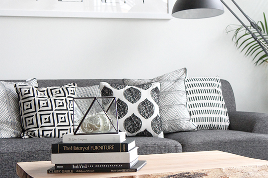
In my own living room, I like to keep the color scheme fairly neutral, but it’s the textures on the pillows and planters that provide the little details that keep the room from looking too blah.
Provided that you cleanly edit the color choices, minimalism is all about keeping balance around the room. Amy of “Homey Oh My” (below) shows this idea off well in her living room with a textured rug and a simple basket for storing items to keep clutter off the coffee table.
Emma’s cowhide rug and two-by-four coffee table (and oh look . . . natural wood again!) follow right along with this style, too.
#5 Plants, Plants, Plants
It’s never a bad idea to bring more of the outside in (well, except maybe pests). But have you noticed the last element that keeps sleek rooms looking lively? Plants! Whether it’s bouquets of flowers or potted houseplants, varied height plays a big role in keeping things looking uncluttered. I think the greenery adds a lot of life and cheer (especially in routinely disappointing spaces, like my laundry room).
Maybe it’s about getting older and realizing that I am happier when I have less around me to feel anxious about (or clean). Or maybe it’s the desire to need less. Or maybe it’s just with so much else keeping me busy on a daily basis, adding more negative space (subtracting to add, I suppose?) is the calm I need at the end of the day.
But regardless of the reason, I’m getting better at figuring out how much nicer a home is without a bunch of clutter in my way.
Related:
